How to do more with your data: Lessons from the Domestic Data Streamers
It's one thing to make a point with data—it's a whole different thing to make your audience care. Here are some tips from the experts on telling stories and creating empathy through data.

So you' ve got the data to back up your argument, and you' re ready to present it to your customers, your manager, or your team. But how do you get the message across in an effective way? You want your audience to understand the data on a rational level—but you' d like to reach them on an emotional level, too. That' s how you inspire someone to take action, after all. But how do you do that?
Meet Domestic Data Streamers (DDS). If you don' t think visualizing data for a living is a particularly sexy job, that' s because you haven' t met Axel Gaulla Rogia and his team yet. This Barcelona-based design studio was founded in 2013 with the idea that " the world couldn' t be understood without numbers, but it wouldn' t be understood with numbers alone" .
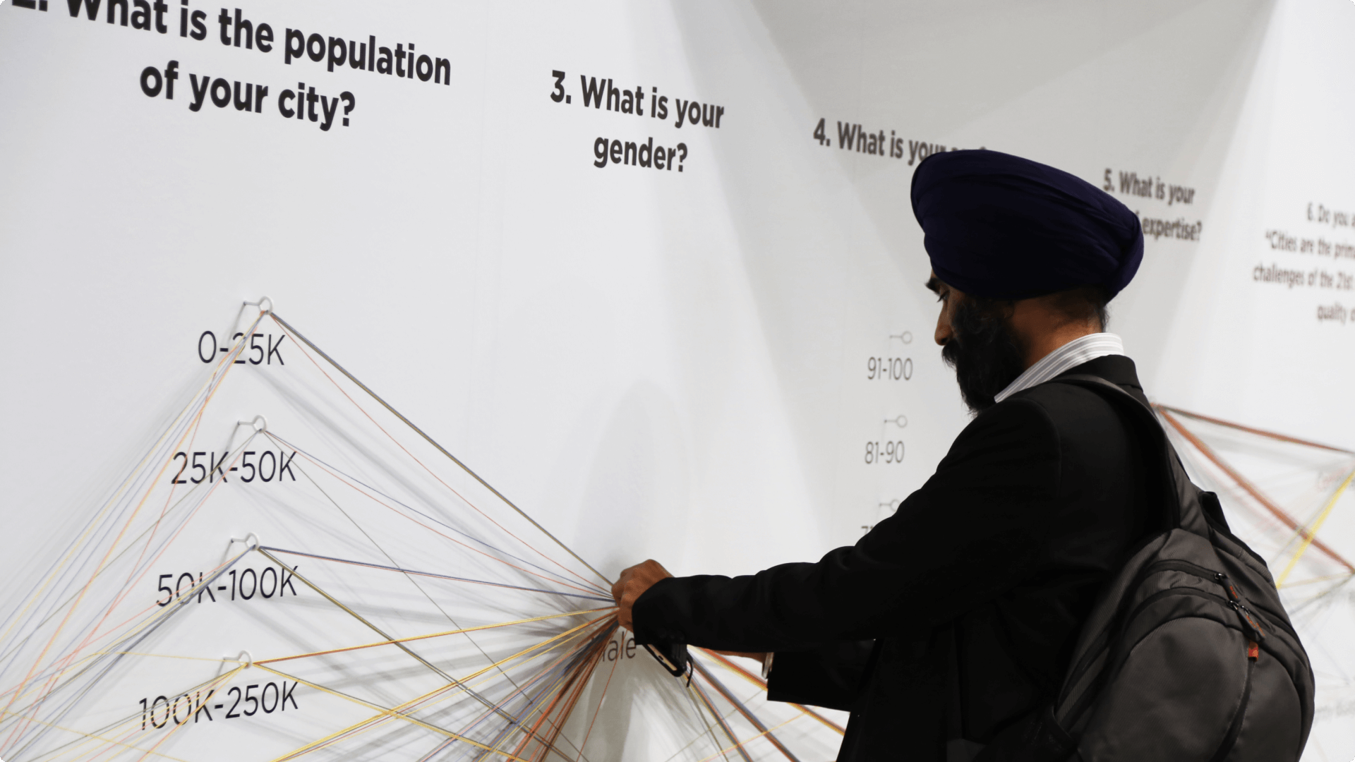
They have created physical and online interactive experiences for the likes of TED, the United Nations, and Spotify—by combining data with creativity, innovation and art. Check out some of their work here.
How did the idea come about, you' re asking? Cofounder Axel observed that we' re inundated with information daily, but that few of us are driven to take action. " Take for example, the news about all of the refugees trying to cross the Mediterranean Sea. While news outlets portray these individuals' extreme hardships, for many of us, it' s just one more item in a thread of stories," he notes. Through this, Axel and his team realized that maybe information alone is not enough.
So Axel and his co-founders made it their mission to not only show information, but to tell stories around it. Something that will not only inform, but also affect you in a meaningful, lasting way.
One thing that makes DDS so successful and unique, is their outside-of-the-box data visualizations. From an interactive lab collecting answers in liquid form, to three-dimensional video sculptures interacting with visitors—they always come up with original ways to illustrate information and get their point across.
Using data as their primary source of truth, they create a platform where people can have discussions around datasets. In other words: experiences that create a space for different perspectives.
Here are three principles that DDS follow that can help you tell more meaningful stories with your data.
1. Use bold visualizations
Be bold when thinking about how to visualize your data—because when something surprises your audience, it will make them think more and leave a deeper impression.
Use bold, colorful, and dynamic visualizations to exemplify the ratio between two aspects, or create contrasting effects. Here' s an example of a project DDS did for the Design Museum of Barcelona: an installation full of black and white balloons, all positioned at different heights, which represent the desired life expectancies of a group of surveyed people.
The 800 balloons mark the point between someone' s real age, and the age at which they' d like to die, contrasting the information with their gender (more details here).
You can also help your audience understand new, abstract information better by appealing to their existing knowledge and drawing analogies and comparisons to something familiar. Say you want to illustrate the size of your website' s user base—compare it to a number your audience can relate to. " Right now, we have 21M registered users—that' s equivalent to the population of Florida." Need to illustrate a complex process better? Use the analogy of something familiar, like a house construction: " Before we think of the roof and balconies, we need to first take care of the foundation of our house."
The point is to make something invisible visible by materializing an abstract topic.
Also, don' t limit yourself to the visual dimension—remember you can involve several senses to perceive data. You can transform information into something audible, tangible, even smellable.
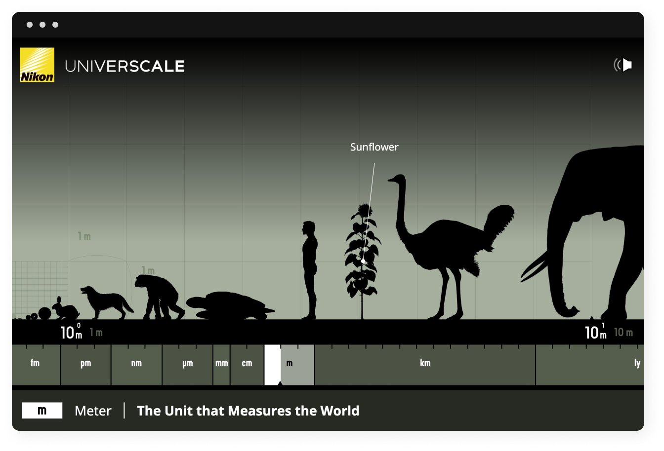
Don' t worry if you can' t create fancy art installations like DDS. Visualizing data can be as simple as starting off your presentation with a photo or an animation that symbolizes the main point you want to make with your data, or an image of two or several opposing objects to illustrate the ratio between different things. Like in this example of Nikon' s Universcale:
(And if you do have the possibility to create something big and creative in the style of Domestic Data Streamers—go for it!) At the end of the day, despite what many people say, you actually can combine hard data with creativity and art.
The more daring and original your approach is to visualize your data, the more likely it is to spark a conversation.
2. Get creative with your sources
Let' s say you have a garden full of flowers and other plants. If you had to choose between self-pollination, i.e. the transfer of pollen between plants of the same species, or cross-pollination, where pollen of different types of plants mix—which one would you choose?
If you value variety, you' d select the latter. Without cross-pollination, our flora would look a lot more monotonous. Integrating information from different sources makes for a much richer world.
The same applies for generating meaningful insights through the data you collect. The next time you need to run a survey, think about where you' re getting your information from. Ask yourself, " What are the limits of my respondent pool? Are there more people I can get valuable feedback from?" Even if this extended pool of respondents isn' t directly connected to the question you are trying to answer, you' d be surprised at how valuable the inclusion of this extra information can actually be.
For example, when DDS ran an assessment of their company culture, they wanted to do something different than just the typical office culture survey. So apart from creating a survey for their employees, they also created one for the employees' families and friends, asking them questions like: " What do you think your wife/father/sister/friend is doing at Domestic Data Streamers?"
Axel laughs: " As you can imagine, the answers were absolutely crazy." But the exercise was about more than just making the culture assessment entertaining and fun. By involving more people than necessary, it allowed DDS to collect additional information on what kind of reputation they have in the outside world. For instance, they found out that their employer branding is much better than what they thought: " Many of the surveyed family and friends said, they have no idea what their loved ones are doing at DDS, but what they do know is that they are having a great time at work." And this kind of feedback is priceless, especially if you get it not only from the employees themselves, but from the people around them. Hearing about your employees loving their workplace from the people who know them best, is a strong confirmation that you' re going in the right direction as an employer.
Also, thanks to the extended survey, DDS managed to create a stronger bond between the employees and their social circles. It helped the latter better understand their loved ones' jobs at DDS, by giving them better insight into their day-to-day. Nowadays, if you walk into one of DDS' s own exhibitions, you' ll see a different DDS employee every day giving tours of the exhibition to their family members and friends, voluntarily. Because when you love what you do, you want to share it with the people you love.
For DDS, involving a larger audience of respondents than initially planned, really paid off. They learned additional insights from fresh outsider perspectives, and this gave them ideas on how to improve their company culture further. One example is their company parties. With the realization that a company only works through the help of several generations, Axel and his co-founders decided to make the company parties more inclusive. The concepts are now more family-friendly. They also moved the start to earlier hours, so that grandparents and children could attend, too. " It might look strange at first, seeing the youngsters partying at the bar next to the grandmas and uncles drinking their tea," said Axel. " But we think it' s important to cohabitate. All of these people are an important part of our employees' lives—and that means they are part of DDS, too. We need to integrate them. A company needs to be a social hub, not just a company.”
So, think about this next time you need to generate insights. Maybe there' s an extra-step you can take. Maybe there' s a way to go beyond and enrich your results with more variety. In other words: how you can cross-pollinate your garden of data insights, and improve your company, service, or project.
3. Engage with your questions
Something else DDS realized with their extended company culture survey is that it helped them open up a dialogue between them and various groups of people from different backgrounds on important current topics.
Axel and his colleagues had relevant conversations with their employees' parents and other people from older generations who were not used to submitting information through online platforms. By exposing them to modern technologies they usually don' t interact with and letting them answer the survey on their mobile phones with a few clicks, DDS could show them that using online tools can actually be quite easy, while at the same time collecting insightful data from them.
Another way they made those surveys more accessible was through the language and style of the forms. Axel and his team understood that if you add a human touch to the smooth technical experience, you are much more likely to receive thoughtful answers instead of mono-syllabic, reluctant ones. So they used cozy language in their survey, and gave it a nice design. " We' re getting more meaningful insights by asking questions in this playful way," he says.
Takeaways
So, what can we learn from DDS' s approach?
- Visualize your data and the message behind it, and be bold when doing so.
- Get a more complete big picture by including a wider range of respondents.
- Create a stronger bond with your audience—employees, customers, or other survey respondents—by showing them you care. How? By caring about what they care about. Include topics and people that are important to them, if you can.
- Help non-tech-savvy people navigate with the tech of our modern world by making it easy for them to access your information and submit theirs. Use tools and communication channels that are easy to use (on the respondent side), fun, and appealing to the eye. At the same time, you' ll be rewarded by getting insights from a group of people which normally it would be difficult to receive information from.
- Get more substantial insights by asking questions in a human, playful way. In a world of anonymous, one-to-many online interactions, it' s great if you can stand out with empathy. Like Axel says, only this way you can have the kind of relationship you want to have with your audience.
Over to you
And that' s the point: when you care about your relationships, both business and personal, it shows on every level. Numbers will stop being just numbers. So it' s definitely worth rethinking how you collect and visualize your data, where you get it from, and who you ask the questions to.
Ultimately, the audience that experiences the message of your data, will feel its importance if they also grasp the meaning behind it, both on a rational and emotional level.
Finally, here is a conclusive thought for you—a sentence DDS likes closing their speeches with at conferences:


