How to design an onboarding form that perfectly captures your brand, like Kilo
Kilo is a mental health app for men. Its branding is designed to speak to guys who don’t feel represented by the mental wellness industry. Sleek and dark-mode style: self-help, but make it sci-fi.
Amanda Bender, the founder of Kilo, wanted to onboard beta testers with a form that had exactly the same vibe. Here’s 7 ways she did it:
You will need:
- Typeform plan Plus and above to add your own branding
1. Change the color scheme and fonts
Insert a Welcome Screen and open up the Design tab on the rightside panel. Here, you can customize the font to your brand, and change the colors of the text, background, and buttons. Remember: the settings you choose will apply to every question.
2. Add your logo to the Welcome Screen
To add your logo, click on the Question tab in the right side menu. Scroll down until you see “Image or video.” Here, there is the option to add in media, and choose where it is displayed on the page. Amanda wanted her logo right in the center.
3. Remove the Typeform branding
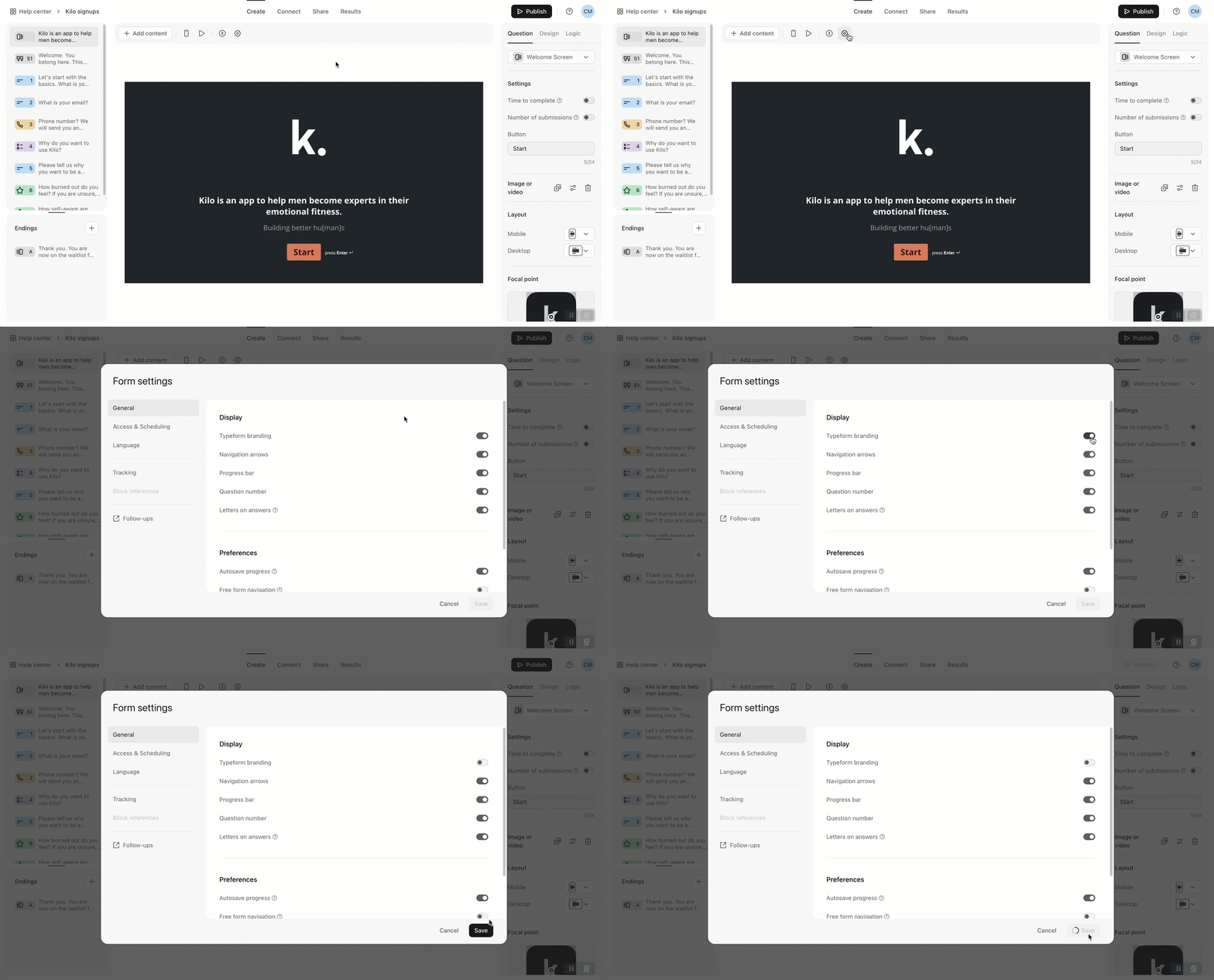
To make this form feel like it’s completely owned by your brand, remove the “Powered by Typeform” icon in the bottom right corner. To do this, click on the Settings wheel and toggle off Typeform branding.
4. Add a Statement question
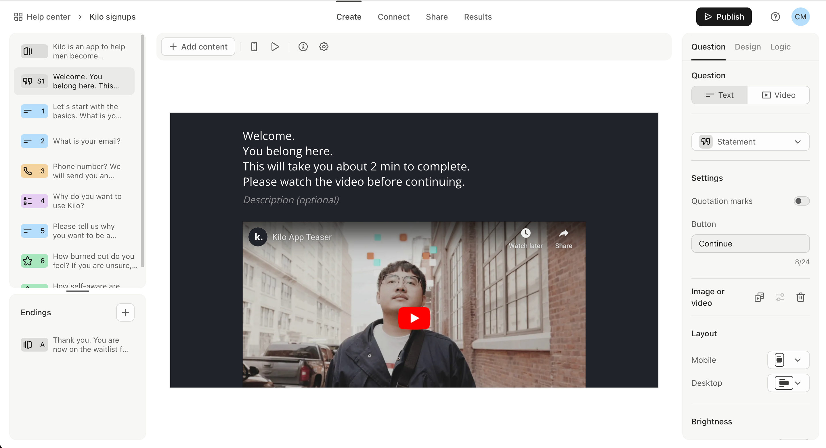
If you want your brand to speak directly to the participant, you can add in a Statement question. This is a question that doesn't require an answer - a place to introduce what you’re about, or what you’re going to ask.
5. Add a video
Amanda added a video to her Statement question to give it a bit of pizazz. To do this, click on Question in the right side menu, and scroll down to "Image or video." From here, you can either paste a link to a cool video you’ve uploaded to YouTube or Vimeo, or search a database to find something suitable.
6. Throw in some emojis
Instead of sending you a notification when it’s time to use the app, Kilo sends a text, like a caring buddy. So it makes sense for Amanda to use an emoji or two throughout her form. Typeform doesn’t have an emoji keyboard, but if you paste emojis from online databases like Emojipedia and Get Emoji, they’ll show up.
7. Customize your Rating questions
If you want to use a Rating question, you can choose how your scoring shows up from a bunch of very cool symbols. Simply add your Rating question, then go to the Question menu and select which icon you want in Settings.
There’s loads more that you can do to customize a form, but here’s how just a few simple tweaks can bring across the essence of your brand.
