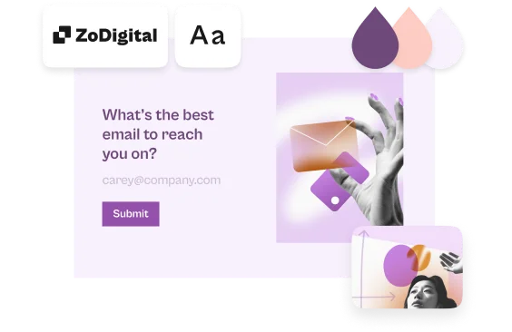
6 tips for creating a beautiful form, with Hey Studio
Not everyone is design minded. And that’s okay. But you can still make a typeform that oozes design and stays true to your brand.
We spoke to Veronica Fuerte, founder of Barcelona-based creative design studio Hey, about the principles of good design.
“In small businesses, everyone has to do a bit of designing. But you don’t need to be a professional to apply the basics of good design,” says Veronica.
The same goes for creating a typeform. Designing a standout typeform doesn’t have to be a daunting task– all it takes are a few key design principles and a little bit of experimentation.
Below are six design tips from Hey Studio that make for a killer design, and how you can apply them when creating your typeform. Watch the video above to see each one in action.
1. Design matters
“Design is the face of your brand, and you might not realise it, but you’re making design decisions all the time. The typeface you select, the color you use, even the way you format an email— all of these details affect how you present yourself, and how you are perceived,” says Veronica.
Apply it to your typeform:
When designing your typeform, make sure that you're staying true to your brand's look and feel. Whether that's adding your logo to the welcome screen, or using the same typeface as your website, you want to make sure that people can recognize your brand immediately.
2. Keep it simple
“The more different concepts you try to show in one piece, the less people will understand your message [...] Simplicity will not make your design feel boring or lacking—it’s actually a key principle of good design,” says Veronica.
Apply it to your typeform:
You can add images, change colors, add your logo, and tweak the layout of your form—but you don't have to change all of these design elements in one shot. Pick one design concept, like icons or images in the same style, and make that the focus of your typeform.
3. Create levels of info
“Design helps us differentiate the importance of individual bits of information by size, shape, color, and typography,” says Veronica.
“By generating contrasts between elements, we can naturally draw people’s eyes towards more important information.”
Apply it to your typeform:
Your tone of voice is part of your brand. Make your questions approachable, and use different question types to highlight different types of information. You can use the description setting in questions to add additional information without taking away from the question itself.
4. Make it harmonious
“Harmony is a balance of color, texture, and contrast that is visually satisfying. If a design is not harmonious, it feels incoherent. One way to achieve harmony is by using the correct color palette, and making sure this fits with the surrounding elements,” says Veronica.
Apply it to your typeform:
Use our Unsplash-powered image library to add a background to your typeform. Or, add images to questions and use layouts to keep people engaged. Find images with a similar style and color palette to ensure consistency throughout your typeform.
5. Use color wisely
“Color is one of the main pillars of design,” says Veronica.
“It has its own universal language, so it’s very important to take time and think about which ones to use—and how many. Different colors inspire different emotions, so make sure the colors you choose transmit how you want people to feel.”
Apply this to your typeform:
Choose colors that are complementary, like blue and orange, or red and green. Make sure that your question, answer, and button colors are easy to read on your background. You also want to make sure that you match the tone of your typeform and its purpose with your color pallette.
6. Aim for consistency
“Always keep in mind whether the piece you’re designing looks coherent with your company’s other designs. If your designs are coherent and consistent over time, people will naturally be able to remember your brand or campaign when they see it,” says Veronica.
Apply this to your typeform:
You can save your typeform design as a theme and reuse it for other typeforms to ensure consistency across forms. Making small tweaks, like changing the layout of questions or adding a range of colors, can help distinguish different typeforms for different purposes.


