Building a quality form takes a little bit of practice, a little bit of patience, and a few best practices. But ultimately, it's pretty easy. Get out there and get asking with our 11 simple tips to creating a better (type)form experience.
At a glance:
1. Start your form with a quick question
2. Give respondents a reason (or incentive) to fill out your form
Latest posts on Product
3. Include a CTA
4. Write in your (or your business's) voice
5. Be sure your questions are inclusive and relevant to your intended audience
6. Use the description space in typeform questions carefully, use it to guide or reassure the respondent - but only use description text if it’s absolutely necessary
7. Carefully consider the questions you're asking - are they all necessary?
8. Make things personal - use typeform Recall function to dynamically use your respondent's name in your form
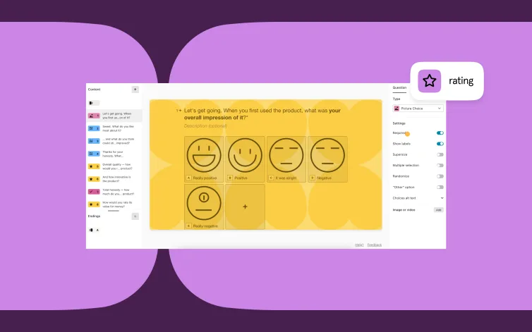
9. Incorporate emojis if it feels right!
10. Contextualize the user journey - let folks know if they're halfway or if the next question will be their last
11. Customize the submit button
To understand the psychology of a friendly and attractive typeform, we called in the help of our friend, Elizabeth Stokoe. Elizabeth is a Professor of Social Interaction, meaning she studies the way we talk. She's helped all kinds of organizations achieve their goals by transforming how they interact with customers.
Her next goal? Transforming how you interact with your customers.
Liz spent a few weeks diving deep into a stack of typeforms, eventually resurfacing to give us these tips. Follow them for clear, friendly, conversational forms that’ll impress your audience—and get better results.
Learn more about Liz and how she can help your business here.
Start with a question
In real life, we ask questions all the time to start conversations. How’s it going? What did you get up to this weekend? What on earth have you done to your hair?
Questions are immediately engaging. Start with one in your Welcome Screen.
Use the copy on the Start button to compliment what you’ve said in the Welcome Screen text. In the example above, the call-to-action (CTA) “Send feedback” follows from the question “Are you happy with our services?”
See Encourage action below for more info on the Start button.
Did you know you can add an image to your Welcome Screen using Typeform’s built-in image search? Learn more about it here.
Get people invested
If you send out a typeform, you want people to complete it and provide relevant answers. You want them to believe that filling in your form is worth their while. Because people are busy and time is finite.
So make sure the Welcome Screen provides people a reason to fill in your typeform. If you don’t, they’ll leave—simple as that.
Add a benefit to the Welcome Screen to give people a why. It could be as easy as helping out colleagues with feedback. Or being the first to get breaking news by signing up to a mailing list.
Encourage action
Much like these people, the CTA button has one job—get clicked.
The default text for buttons is usually something generic, but you can change it. Fit your CTA to your typeform and be clear about what’s going to happen next.
If it’s leads or signups you’re after, consider adding a benefit in the CTA. Like “Sign up for insider tips.”
Type the way you talk
Everyone has their own voice. They might want to sound formal or casual, professional or friendly, strait-laced or wacky.
When you write questions for your template, think about how you’d ask them face-to-face. We think it’s easier to connect with your audience if you write in a conversational way.
Cut out the jargon, speak in first person, and contract your do nots to don’ts.
Want more tips on writing like a human? Talk to this article.
Know your audience
We talk to people differently depending on how well we know them. So know who you’re talking to before you create your typeforms. It’s easier to build trust if you’re familiar with your audience.
And remember: people are diverse. Be mindful of how you ask about gender, race, and income. Research the best way to ask sensitive questions and provide inclusive options.
Not sure how to ask? Get some pointers from our article on demographic survey questions.
Take advantage of descriptions
You can add a description under most typeform questions. Use this to guide or reassure the respondent without taking up too much space in the question text.
Pro tip: only use the description text if it’s absolutely necessary.
And avoid using the description to clear up ambiguity in your main question. If you feel the need to do that, your question probably isn’t clear enough.
Try this: if you remove the description, does the respondent still have all the info they need to answer the question?
Empathize with your respondents’ fears about answering a particular question, and address this in the description text. Like people’s concerns about giving away their email.
Put survey fatigue to bed
The more questions you add to your typeform, the more likely you’ll overwhelm your audience—and the less likely they’ll complete it. With that in mind, try to avoid needless questions.
For example, many surveys start by explaining in detail what’s coming next. “You’ll now be shown a series of questions about…” It can be intimidating. So instead, just give people the info they need to get to the next question, step-by-step.
Grouping questions together provides a feeling of structure and progress. It also a good way to ask a few varied questions around the same theme. For example, a series of questions asking you to rate someone’s job performance, using the same 5-point scale.
You’ll need to add some text to frame the question group and help respondents navigate what they’re about to see. But it doesn’t need to be wordy. Here’s an example asking about someone’s achievements:
Make it responsive
In real life, we respond to things other people say. You can also do this in a typeform. Use Recall Information or just type “@” to recall a previous answer.
We also use people’s names in real conversations for all sorts of reasons. You can recall someone’s name using the same method to make your typeforms feel more personal, like we did here for John:
A word of warning: people easily spot inauthentic personalization, so don’t overuse this feature.
Respondents don’t necessarily want to build rapport with you, they want to get something done—the reason you promised at the start of the typeform.
Sprinkle in some emojis
Ever received an innocent message that felt cold and direct? That’s because written words don’t land like they do when speaking face-to-face. And that’s why emojis are great—because they can help give a personality to a faceless organization.
They can convey an emotion, or even change meaning, by adding intonation that our voices provide in real conversation.
Use them sparingly, and know the tone of your typeform. An employee evaluation form might not be the best time for inappropriate emojis.
Nudge people to the finish line
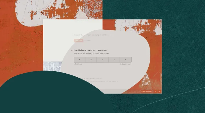
For longer typeforms, it’s a good idea to tell people how far they’ve come. If they’re halfway, you could add an encouraging statement to push them along: “We’re halfway there—you’ll be done in no time.”
If it’s the last question, tell them. Otherwise the “ending” can feel abrupt, as if someone’s suddenly walked off mid-conversation. It can be as simple as “And finally,” “Just before you go,” or “Last question.”
Note in the example above, we also tell the respondent what’s going to happen next in the description. It sets expectations, and reduces worry about how we’ll act on their responses.
Customize the Submit button
Submit is the default text for the last button in a typeform—the button that sends your answers to the typeform creator. You can—and should—change this. Go to Settings > Messages and look for Button to send typeform.
Like the Welcome Screen button, you should make it relevant to the action that someone’s taking. It could even evoke some sort of emotion—after all, completing this typeform might be the first step to something great.


